Fylo
A design to website conversion created from scratch View Site | Code on Github Tools Used: React, Sass What it does I was given some design images (mobile and desktop), some…
A design to website conversion created from scratch
What it does
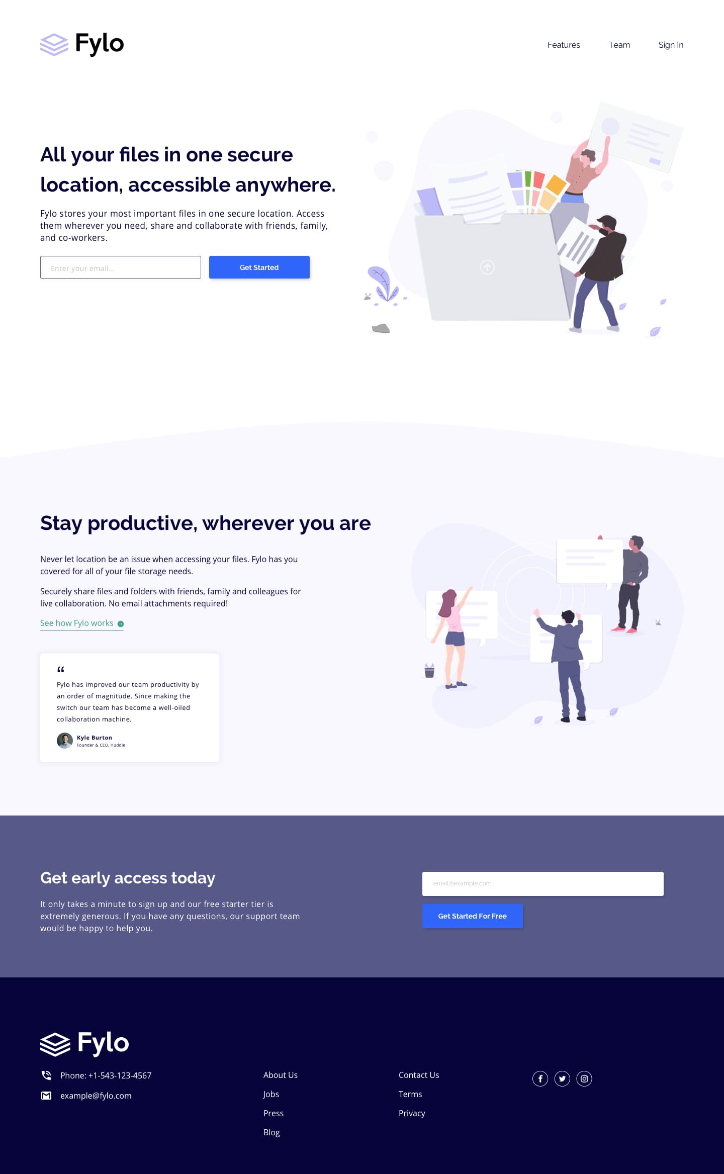
I was given some design images (mobile and desktop), some colours to follow and content that needed to be on the page (avatar images, logo etc.).
My task was to create the page from scratch without any frameworks or tools, aiming for 2 viewports (desktop: 1400px, mobile: 375px).
It took me roughly 4 hours of casually developing it using flexbox with a mobile-first design, including performance, accessibility and SEO optimization for elements on the page, giving it an overall lighthouse score of 94-100.
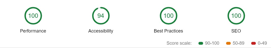
The only reason accessibility isn’t 100 is because of some colours as given by the design
I used sass variables to implement the design’s colour palette, created reusable classes for the button and input, as well as creating a reusable card component.
Flexbox was used to create a responsive layout, as the layout needs to change directions when changing to the desktop design, I used flex-direction to position the elements correctly depending on the view width.
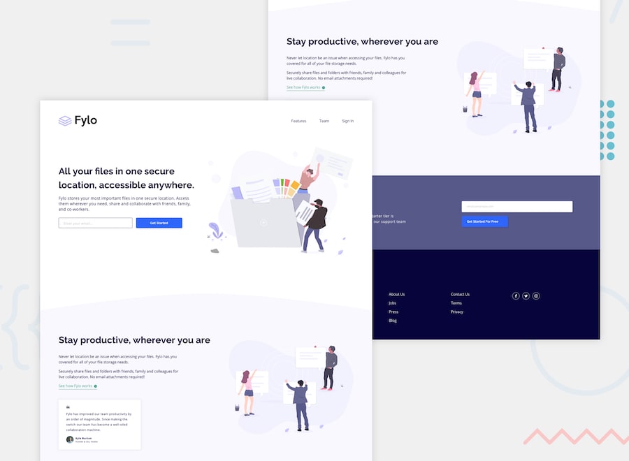
You can compare the below design to the Live Website